Making meaning visible
Making lucid sense of a big mess of information is one of my favorite things to do. Here are some of the ways I help my consulting clients make the meaning of their work visible.
When people come to me for help with communications, they usually think they need help with words — but really, they need structures for ideas. As a consultant, I often create visual tools that help my clients understand and communicate their work in simpler, clearer, more powerful ways.
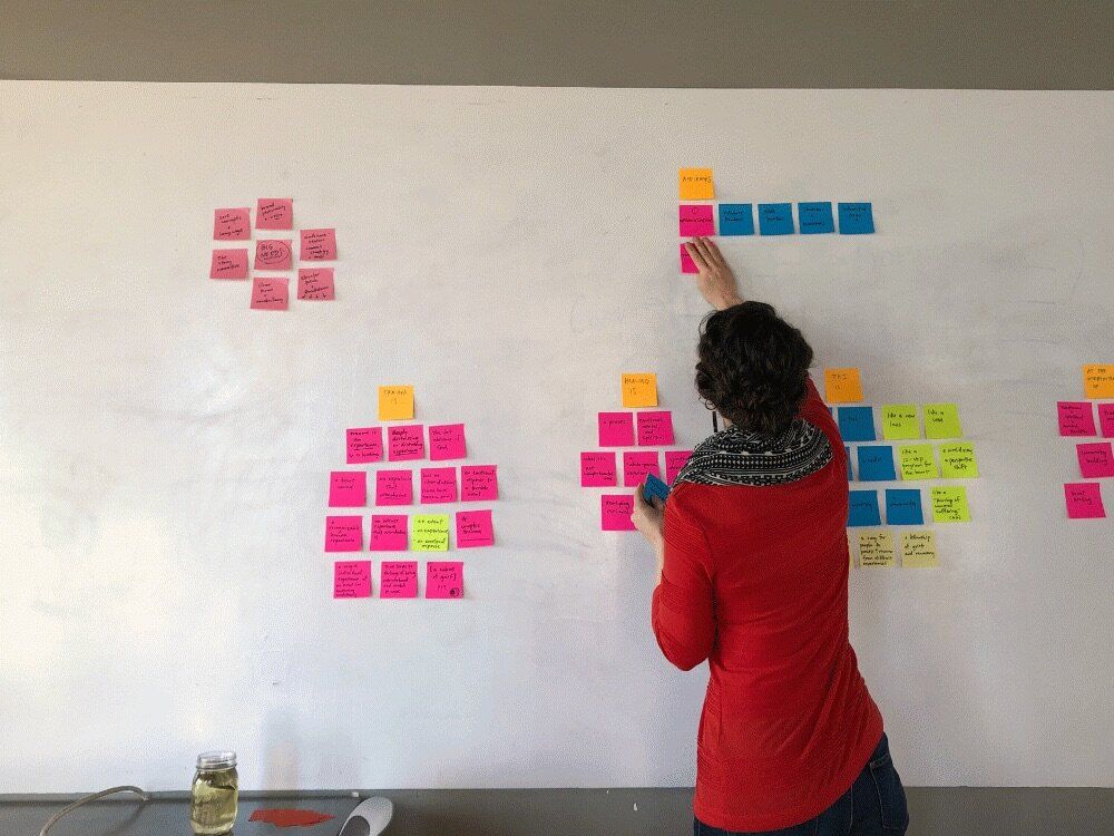
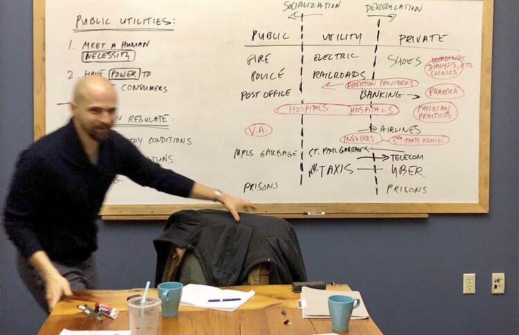
Boardwork
Once a professor, always a professor: most of my work involves mapping out the relationships between ideas on a whiteboard. In fact, some clients hire me specifically to do this kind of conceptual mapping.
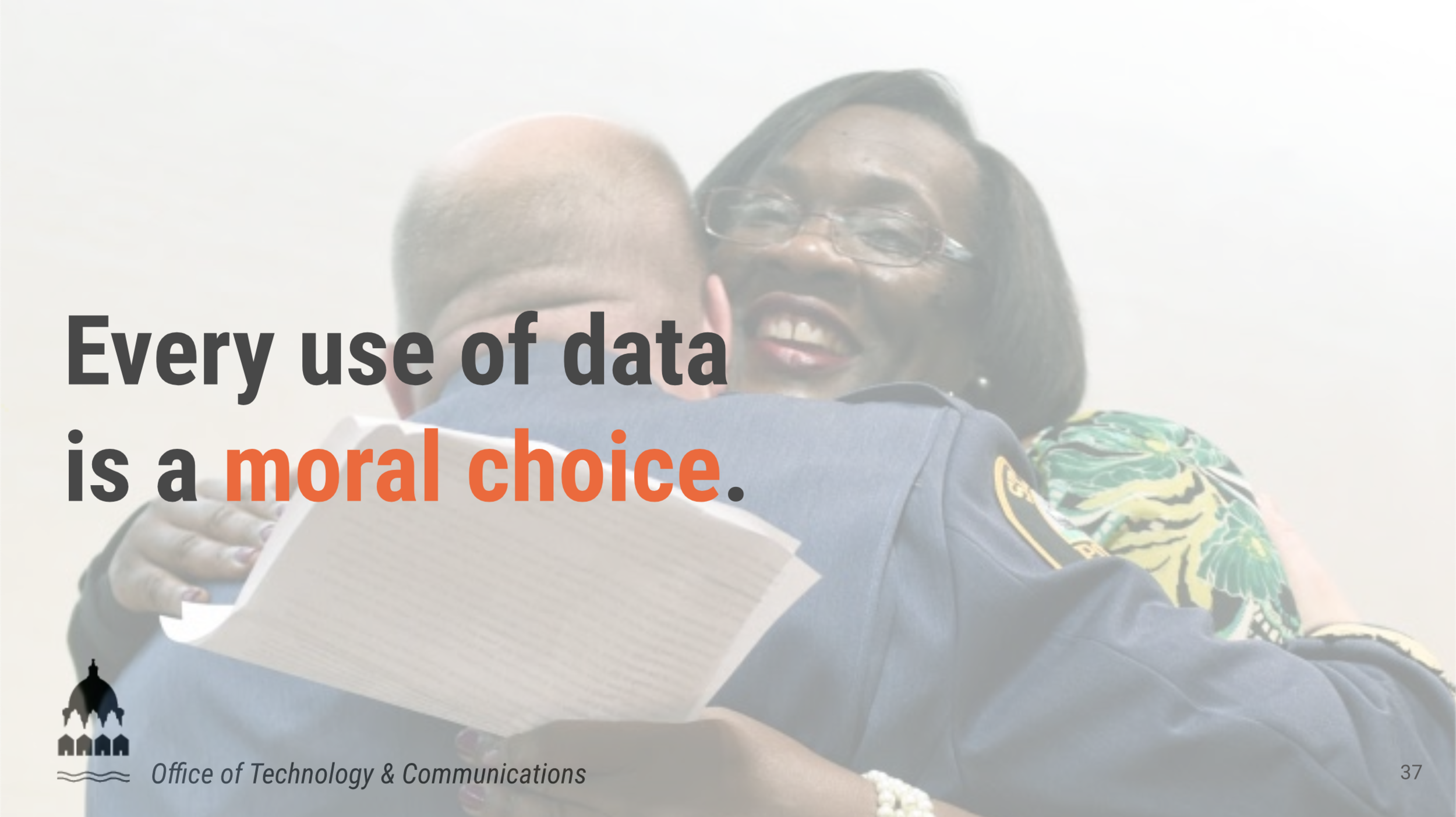
Curriculum
I’ve been teaching for going on two decades now, and I’ve learned how to use language as image to make ideas easier to remember. I built this training deck from the ground up to help the City of Saint Paul train 12,000 employees about data culture.
Graphic
Sometimes a picture can communicate more than words ever could. I created this graphic for the Warren campaign in Minnesota, as part of a series of that encouraged Minnesotans to vote early by focusing on specific moral values.

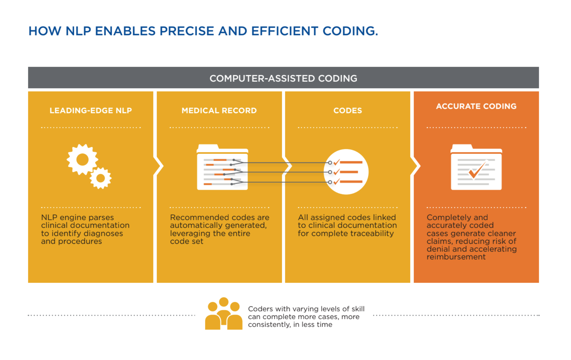
Diagram
The word “diagram” comes from Greek words that mean “drawing through.” Here I wrote copy and directed the work of a graphic designer to make this diagram. It draws through a complex series of processes to explain a new health care technology.